Improving the Efficiency of Multi-Region Underwriting
at a nationwide healthcare organization
Web Application
Lead UI/UX
2 Year Duration
Improving the Efficiency of Multi-Region Underwriting
at a nationwide healthcare organization
Web Application
Lead UI/UX
2 Year Duration
Improving the Efficiency of Multi-Region Underwriting
at a nationwide healthcare organization
Web Application
Lead UI/UX
2 Year Duration
Improving the Efficiency of Multi-Region Underwriting
at a nationwide healthcare organization
Web Application
Lead UI/UX
2 Year Duration


Overview
Overview
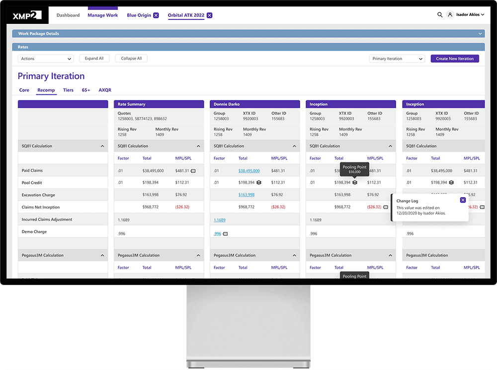
I was the senior product designer on a product design engagement for a healthcare insurance underwriting web application aimed at significantly improving the efficiency of multi-region quoting.
I was the senior product designer on a product design engagement for a healthcare insurance underwriting web application aimed at significantly improving the efficiency of multi-region quoting.
Problem
Problem
The legacy underwriting system was plagued by inefficiency and unreliability, frequently malfunctioning and consuming valuable time for underwriters. As a result, their trust in the system's accuracy was compromised, causing delays in delivering quotes to customers—a pretty sad situation for the organization.
The legacy underwriting system was plagued by inefficiency and unreliability, frequently malfunctioning and consuming valuable time for underwriters. As a result, their trust in the system's accuracy was diminished, causing delays in delivering quotes to customers—an unacceptable situation within the industry.
Vision
Vision
The business envisioned a new web app that would make the quoting process faster and more accurate. They wanted to combine the best parts of the old system with new improvements, making sure it's easy for users who were deeply familiar with the old platform to get on board. The main goal was to update the outdated workflow, making everything run smoother and the quotes more precise, saving the organization millions of dollars and dramatically improving the speed at which complex quotes could be delivered to existing and prospective customers.
The business envisioned a new web app that would make the quoting process faster and more accurate. They wanted to combine the best parts of the old system with new improvements, making sure it's easy for users who liked the old platform to get on board.
The main goal was to update the outdated workflow, making everything run smoother and the quotes more precise, saving the organization millions of dollars and dramatically improving the speed at which complex quotes could be delivered to existing and prospective customers.
A Few Details
A Few Details
Intended Audience
The project focused on multi-regional underwriters, adopting a phased approach to balance complexity and cost. Future expansion to include single-region underwriters was planned from the start, ensuring adaptability and scalability.
The project focused on multi-regional underwriters, adopting a phased approach to balance complexity and cost. Future expansion to include single-region underwriters was planned from the start, ensuring adaptability and scalability.
My Role
User Research
Ideation Facilitation
UI/UX Design
Design Systems
User Testing
Quality Assurance
Team Leadership
User Research
Ideation Facilitation
UI/UX Design
Design Systems
User Testing
Quality Assurance
Team Leadership
Scope & Constraints
The scope of the project was to develop a desktop-only web application, tailored for users who needed to analyze large amounts of spreadsheet data. A significant constraint was the aging front-end technology stack, nearly fifteen years old, which limited the capabilities of the UI component library. Consequently, there were considerable challenges meeting the evolving demands of the business and building a modern, efficient user experience.
The scope of the project was to develop a desktop-only web application, tailored for users who needed to analyze large amounts of spreadsheet data. A significant constraint was the aging front-end technology stack, nearly fifteen years old, which limited the capabilities of the UI component library. Consequently, there were considerable challenges meeting the evolving demands of the business and building a modern, efficient user experience.
Process
Process
As an external consultant, I aimed to guide the organization towards a more experience-driven approach by introducing incremental, high-impact changes within their operating environment. My goal was to foster human-centered processes across the organization, ensuring the steps taken enhanced empathy and focused on human outcomes.
As an external consultant, I aimed to guide the organization towards a more experience-driven approach by introducing incremental, high-impact changes within their operating environment. My goal was to foster human-centered processes across the organization, ensuring the steps taken enhanced empathy and focused on human outcomes.
01
Getting to know the users
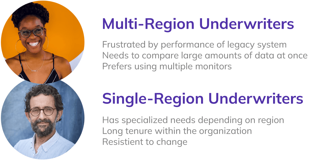
I interviewed roughly six muti-region and a handful of single-region underwriters to get a sense of their objectives, workflows, challenges, and daily tasks. This insight helped me create detailed user personas that were shared with the product, development, and leadership teams. It was interesting that the younger, multi-region underwriters were enthusiastic about transitioning to a new system, allowing us to start from an enviable position with users who were deeply invested in creating something better.
I interviewed roughly six muti-region and a handful of single-region underwriters to get a sense of their objectives, workflows, challenges, and daily tasks. This insight helped me create detailed user personas that were shared with the product, development, and leadership teams. It was interesting that the younger, multi-region underwriters were enthusiastic about transitioning to a new system, allowing us to start from an enviable position with users who were deeply invested in creating something better.


02
Struggling to define even the most basic flows
At the outset, I faced a challenge of outlining the app's architecture and feature set, which was wildly unclear. With little hope of rescue from the Product team, I began working with SMEs and users to understand current state and how it might evolve to become more reliable and efficient. It was through this collaborative process that we started producing our first sets of task flows, which began the faintest sketch of what this system would eventually evolve into. And although it was great to think abstractly about the steps needed to accomplish a task, the most intense work came after I began putting together coherent wireframes.


03
Getting ideas on paper, then iterating a billion times
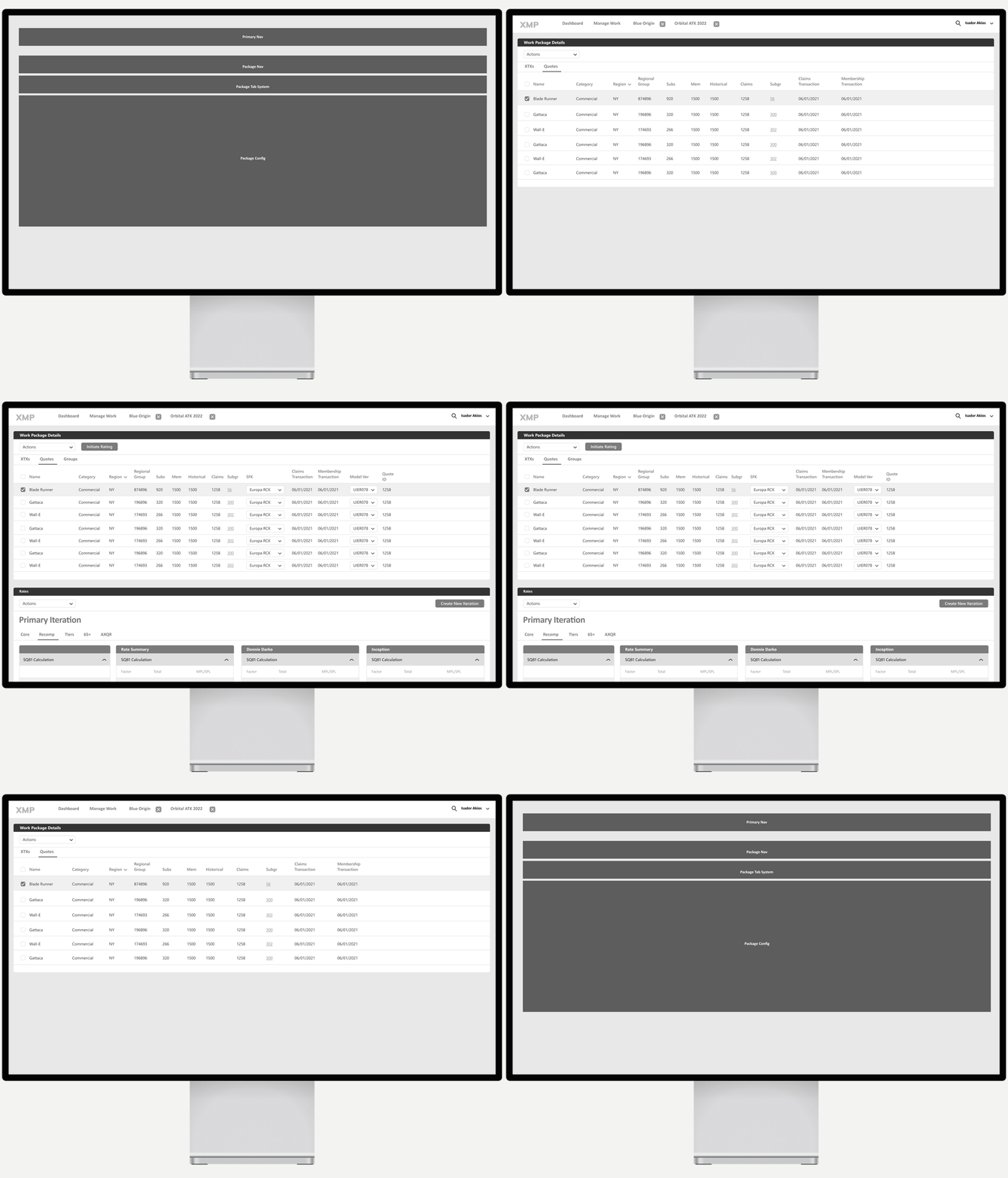
I started with low-fidelity wireframes, essentially greyboxing. With this I was able to outline the core features and user flows. I then began detail to the app to understand how users would make their way through various tasks and flows while ensuring components were available to support these interactions.
The UI library that was required to be used for this project had been wonderfully obsolete for fifteen years. Despite my efforts to move the client to a newer platform, the IT decision was to keep it. So I built a new skin for the library and worked with the development team to build it out.
Next I conducted collaborative design sessions with leadership, underwriting experts, and product and development teams—it was in many of these sessions where the most impactful decisions were made, and often I designed on the spot to gather real-time feedback.
A note about the design we eventually settled on: To address users' need for handling large amounts of data, we adapted the app's design to include spreadsheet-like features with locked columns, although to this day I wish we had had the time and resources to consider a radically different approach to the UI.


04
A mostly-functional prototype goes a long way
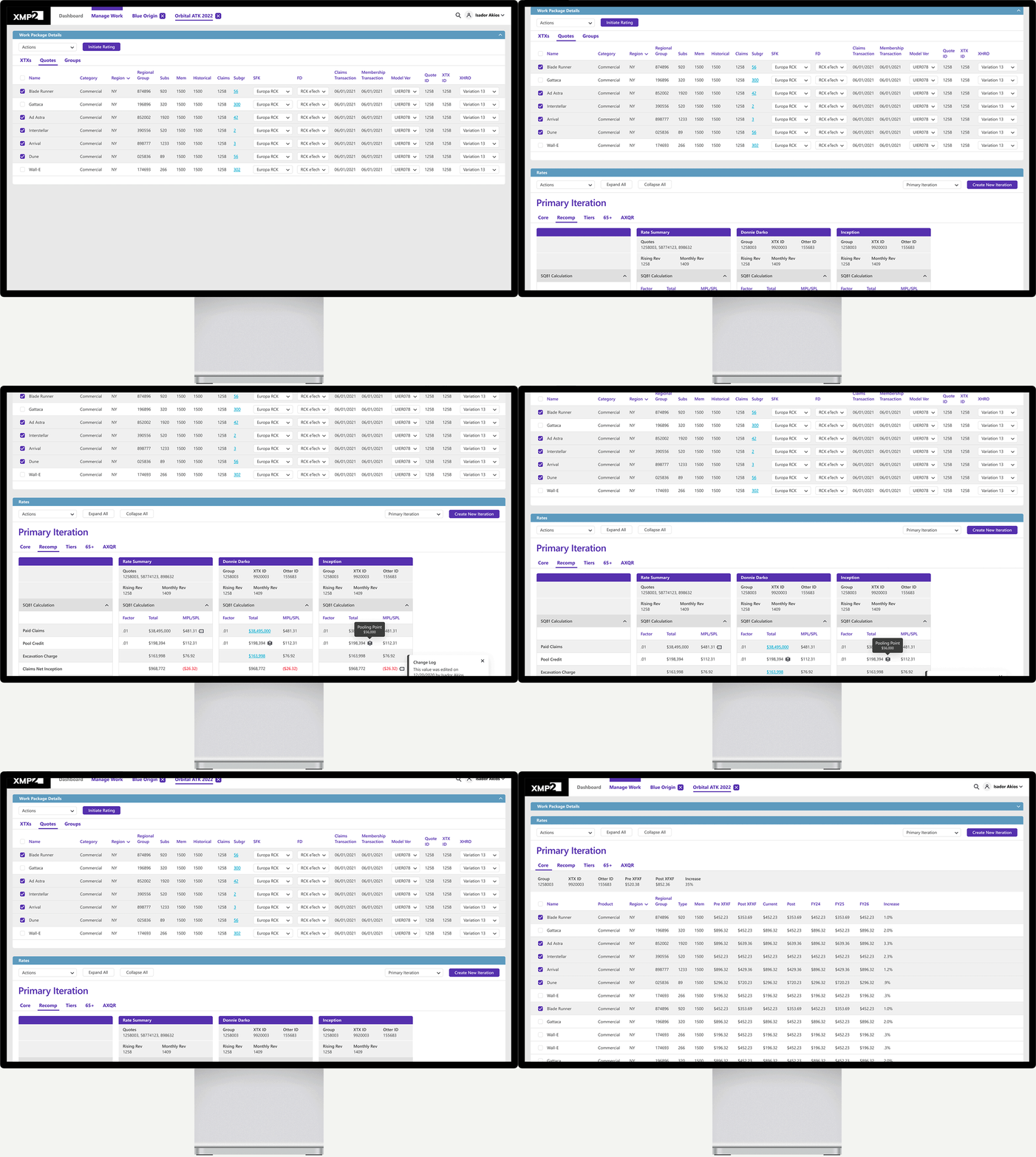
Designing an interactive prototype for a data-heavy system presented unique challenges, notably ensuring that data fields and calculations functioned effectively for user evaluation. To address this, I integrated dummy data and simulated flows into the prototypes. This approach helped users grasp the system's handling of data throughout various task flows during collaborative design sessions and into testing.
Designing an interactive prototype for a data-heavy system presented unique challenges, notably ensuring that data fields and calculations functioned effectively for user evaluation. To address this, I integrated dummy data and simulated flows into the prototypes. This approach helped users grasp the system's handling of data throughout various task flows during collaborative design sessions and into testing.


05
Are we on the right track, folks?
Often we weren't on track. Sometimes we were. I continued leveraging interactive prototypes in collaborative design sessions and usability reviews. This ongoing dialogue with users was instrumental in refining the system's usability and functionality.
The testing strategy was thorough and multifaceted, ensuring the system was working hard for our users. We conducted live demos with our users, ran formal usability studies, provided sandboxes for users to tinker, and executed detailed UAT. Without this crucial testing, building a system as complex as this would have been an impossibility.


06
Breathing life into this thing
I actively engaged in the implementation phase, despite some hesitancy from IT. After all, they didn't want a UX designer coming in there writing visual defects at the end of the sprint, holding up acceptance. Without my presence, there'd be nobody to ensure design integrity and communicate the rationale behind each design decision. So I participated in backlog grooming, sprint planning, demos, and conducted UX quality assurance activities—ensuring the development team adhered to the agreed-upon specifications.
Recognizing the constraints of budget and timelines, compromises were inevitable. However, I prioritized interventions in areas where we could achieve the most significant impact with minimal effort, striking a balance between ideal design and practical implementation.
Challenges
Challenges
One of the primary challenges was the client's foundational expectations. Despite lacking a background in underwriting, I was tasked with developing the app's structure, conducting user research, eliciting requirements, and handling all design and testing phases. Amazingly, I was also asked if my work would be production ready. Overcoming this challenge involved helping the organization understand the product designer's role and the realistic outcomes of our engagement, extending what was anticipated as a six-month project into two years, yet still facing completion challenges.
Additionally, working with an outdated UI Library (shown here) presented significant limitations. It lacked essential components for a modern experience, and the development team was not equipped to innovate within these constraints. This situation was unsatisfactory to business stakeholders, given the gap between potential and actual design quality. I addressed this by clearly communicating the limitations we faced and setting realistic expectations about the capabilities of our current tools.


Outcomes
Outcomes
Following the product launch, there was an impressive 50% average improvement in the efficiency of multi-region quoting, significantly accelerating the delivery of both new and renewal quotes to customers. The launch also addressed a major challenge for the multi-region underwriting team, allowing them to allocate more time to their preferred tasks and less to the rigors of navigating outdated processes and systems.
Following the product launch, there was an impressive 50% average improvement in the efficiency of multi-region quoting, significantly accelerating the delivery of both new and renewal quotes to customers. The launch also addressed a major challenge for the multi-region underwriting team, allowing them to allocate more time to their preferred tasks and less to the rigors of navigating outdated processes and systems.



Reflection
A key lesson from this experience is one of managing expectations. We often hold ourselves and our projects to exceptionally high standards, which can lead to disappointment if the outcomes don't match our initial vision. I had a deeply memorable moment at an internal technology fair where we previewed our system to users, and it reminded me of the genuine impact of our work. Despite my reservations, the users' excitement over the system's capabilities—far beyond what their current tools offered—was both surprising and affirming. This experience underscored that the true value of our work lies not in achieving perfection but in making meaningful improvements to users' lives.
A key lesson from this experience is one of managing expectations. We often hold ourselves and our projects to exceptionally high standards, which can lead to disappointment if the outcomes don't match our initial vision. I had a deeply memorable moment at an internal technology fair where we previewed our system to users, and it reminded me of the genuine impact of our work. Despite my reservations, the users' excitement over the system's capabilities—far beyond what their current tools offered—was both surprising and affirming. This experience underscored that the true value of our work lies not in achieving perfection but in making meaningful improvements to users' lives.
