Improving Customer Safety During the Pandemic
at a nationwide retail pharmacy
Web Application
Senior UI/UX
8 Month Duration
Improving Customer Safety During the Pandemic
at a nationwide retail pharmacy
Web Application
Senior UI/UX
8 Month Duration
Improving Customer Safety During the Pandemic
at a nationwide retail pharmacy
Web Application
Senior UI/UX
8 Month Duration
Improving Customer Safety During the Pandemic
at a nationwide retail pharmacy
Web Application
Senior UI/UX
8 Month Duration


Overview
Overview
I supported a critical initiative focused on enhancing convenience and improving customer safety during the COVID-19 pandemic. My team and I were tasked with crafting a seamless same-day delivery service for essential goods and prescriptions, accessible through both the website and native app.
I supported a critical initiative focused on enhancing convenience and improving customer safety during the COVID-19 pandemic. My team and I were tasked with crafting a seamless same-day delivery service for essential goods and prescriptions, accessible through both the website and native app.
Problem
Problem
While many valued online ordering and contactless pickup, a segment of customers, unable or unwilling to leave their homes or visit stores due to perceived risks, remained underserved.
While many valued online ordering and contactless pickup, a segment of customers, unable or unwilling to leave their homes or visit stores due to perceived risks, remained underserved.
Vision
Vision
Our vision centered on augmenting the current experience by introducing a same-day delivery fulfillment feature directly into the shopping process. This option would complement traditional shipping and pickup choices, accessible from both search results and product details pages. Users would enjoy the flexibility to customize fulfillment preferences within the shopping cart. Beyond convenience, our goal was to leverage this functionality as a preventive measure against the spread of COVID-19.
Our vision centered on augmenting the current experience by introducing a same-day delivery fulfillment feature directly into the shopping process. This option would complement traditional shipping and pickup choices, accessible from both search results and product details pages. Users would enjoy the flexibility to customize fulfillment preferences within the shopping cart. Beyond convenience, our goal was to leverage this functionality as a preventive measure against the spread of COVID-19.
A Few Details
A Few Details
Intended Audience
Our primary focus was catering to customers who sought to avoid in-store visits but needed timely delivery of prescriptions and essential items, ideally within a 2-hour window. Additionally, we addressed the needs of customers who had grown accustomed to doorstep deliveries and sought expanded product options and real-time inventory through our app.
Our primary focus was catering to customers who sought to avoid in-store visits but needed timely delivery of prescriptions and essential items, ideally within a 2-hour window. Additionally, we addressed the needs of customers who had grown accustomed to doorstep deliveries and sought expanded product options and real-time inventory through our app.
My Role
UI/UX Design
Team Leadership
Design System Advocacy
UI/UX Design
Team Leadership
Design System Advocacy
Scope & Constraints
The project scope encompassed enhancing both the website and app experiences, with a primary emphasis on optimizing the website's functionality. The aim was to ensure that the native app experience closely mirrored the website's capabilities. The project timeline was confined to approximately eight months.
The project scope encompassed enhancing both the website and app experiences, with a primary emphasis on optimizing the website's functionality. The aim was to ensure that the native app experience closely mirrored the website's capabilities. The project timeline was confined to approximately eight months.
Process
Process
As an external consultant brought into the team, my main objective was to grasp and align with the organization's UX procedures, starting with addressing their urgent needs first. Given the extensive scale of the program, it wasn't feasible for me to be involved in every facet of product design. Nonetheless, it was crucial for us, as newcomers, to follow a set process. This often meant incorporating research and insights from UX researchers, prepared well in advance of our active engagement.
As an external consultant brought into the team, my main objective was to grasp and align with the organization's UX procedures, starting with addressing their urgent needs first. Given the extensive scale of the program, it wasn't feasible for me to be involved in every facet of product design. Nonetheless, it was crucial for us, as newcomers, to follow a set process. This often meant incorporating research and insights from UX researchers, prepared well in advance of our active engagement.
Process
Process
01
What kind of person needs something like this?
That was my original thought. The organization certainly had an answer for my question—they actually had personas ready when I arrived. They categorized users into two primary groups: customers expressing health-related apprehensions regarding COVID-19 exposure and those who favor the convenience or regularly depend on same-day delivery services.


02
The questions piled up like allergy prescriptions in spring
I had a lot of questions to start, ranging from business constraints to delivery partners and stock level monitoring—there's an enormous amount of considerations to weigh before even touching a wireframe. Some of the bigger considerations included:
Negotiating varying store closing times to define cutoffs for same-day order placement.
Refining UX copy to clearly differentiate between "shipping" and "same-day delivery."
Addressing out-of-stock scenarios and delivery delays, particularly for perishable goods.
Implementing multiple fulfillment options (shipping, pickup, same-day delivery) within a single transaction.
Identifying the most user-friendly point for fulfillment option selection, whether on the product details page, in the cart, or through an interstitial step.
Enhancing stock status visibility and providing options for users to switch pharmacies for items in stock, considering the associated implications.
Planning for product substitutions and crafting tailored email communications for various scenarios.
I didn't get all of my questions answered, but most of the critical ones were addressed. The uncertainty around choosing a same-day delivery partner and integrating their real-time order tracking into our user experience complicated the planning process. Nonetheless, I had to move forward with the information I had.


03
Never getting it right the first time
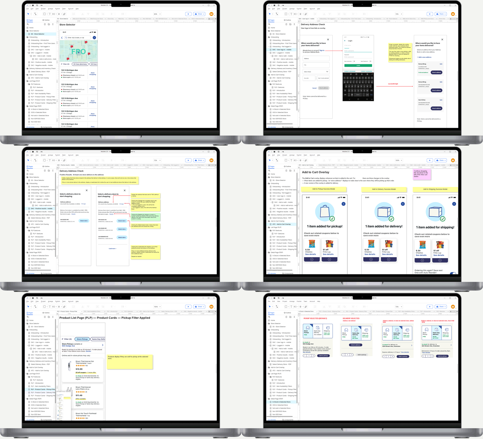
As the lead designer, I supported the entire user journey, from the initial discovery of the same-day delivery service to checkout and follow-up email communications. My team of junior designers concentrated on specific segments of the user journey, including browsing, searching, product details, the shopping cart, and checkout.
Our multidisciplinary team—comprising product, design, and development leads—regularly convened for brainstorming sessions to discuss and refine ideas. This dynamic process allowed us to eliminate less-effective concepts and focus on significant enhancements:
Prompting users to log in or enter a delivery address early in their journey when they signaled interest or intent to utilize same-day delivery.
Introducing search and browse filters by fulfillment option (pickup, same-day delivery, shipping).
Supporting mixed fulfillment options within a single transaction.
Implementing dedicated CTAs for each fulfillment option on product detail pages, organized within accordions for easy access, with the option to change selections directly in the shopping cart.
Determining unique same-day delivery cutoff times for each store, based on store preferences and shipping partner agreements.
Automating email notifications for a range of updates, including order confirmation, shipping status, and out-of-stock alerts.
Facilitating the search for and order from nearby stores when preferred items are out of stock.
Developing a system for substitutions when specific items or sizes are unavailable for same-day delivery.
Designing for these enhancements required careful consideration of numerous nuanced scenarios to ensure a seamless user experience. As designs received approval, my role evolved to focusing on detailed mockups for prototyping and implementation.


04
High-fidelity comps for the executive review
Prototypes were created and were specifically designed to support concept testing with users and for executive leadership review. Given my visual design background, I was tasked with supporting the visual design team with high-fidelity comps.
Prototypes were created and were specifically designed to support concept testing with users and for executive leadership review. Given my visual design background, I was tasked with supporting the visual design team with high-fidelity comps.


05
Getting formal with usability testing
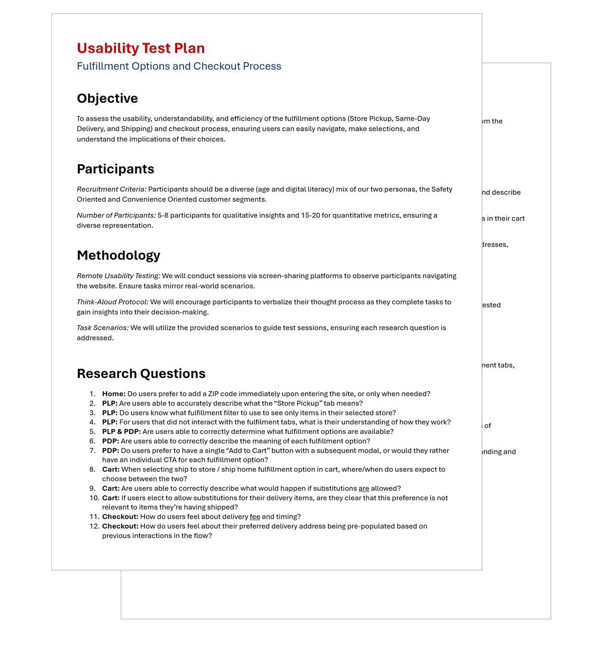
The organization's in-house user testing team collaborated closely with us, utilizing the prototypes we developed and my usability test plan as a starting point. These tests uncovered several critical issues in our design that needed refinement. Through qualitative user testing, we explored various concepts, leading to significant findings:
Asking users for a ZIP code immediately upon entering the site was off-putting for most users.
Despite the apparent similarity, users easily grasped the distinction between "Shipping" and "Same-Day Delivery."
On product detail pages, the preference was clear for arranging all three CTAs in accordions, over our alternative approach of a single "Add to cart" CTA followed by a modal to select the fulfillment type.
Recommendations from the research team were incorporated into the experience design.


Challenges
Challenges
The primary challenges encountered in this project stemmed from its inherent complexity—launching a same-day delivery service within a retail pharmacy setting required extensive strategic planning due to numerous logistical variables, including stock shortages, delivery delays or unavailability, late arrivals of perishable items, and misdeliveries (just to name a few).
Additionally, interpersonal dynamics posed significant hurdles. Diverse preferences among designers and stakeholders, shaped by their personal needs and shopping behaviors, led to considerable time spent pursuing unfeasible ideas. These issues were only resolved after user testing provided definitive feedback.
In the process of optimizing design operations, the organization faced significant hurdles due to its reliance on disparate software tools for wireframing, UI, and prototyping, which compromised efficiency. My push for a modern, unified approach and a high-fidelity component library to streamline workflows, despite its clear benefits, was met with considerable resistance. This opposition was rooted in concerns over the learning curve for the team, already familiar with the existing tools, and underscored how internal dynamics can impede the implementation of beneficial changes in large organizations.


Outcomes
Outcomes
I concluded my role in the project prior to fully assessing the impact of our work. Regardless, we rapidly deployed this new feature at the peak of the pandemic to millions of customers, offering significant peace of mind and convenience to our two main audiences, part of the 8 million customers that they reach on a daily basis.
I concluded my role in the project prior to fully assessing the impact of our work. Regardless, we rapidly deployed this new feature at the peak of the pandemic to millions of customers, offering significant peace of mind and convenience to our two main audiences, part of the 8 million customers that they reach on a daily basis.


