Intended Audience
The primary audience for the service design assessment and the associated UI work was the Circle Line executive team.
My Role
CX Assessment
UI Design
Scope
My scope was to understand the customer and their journey, evaluate the customer experience, and produce recommendations for improvement, especially in UI design.
01
A lot of different kinds of people take these cruises
02
Surprised by low-tech customer experience
It was important to get a baseline for what the customer experience was like, from the discovery of Circle Line all the way through to post-cruise reflections. Business stakeholders again were deeply helpful in helping me understand the numerous avenues that customers take along this journey. Some customers book their tickets online, for a specific time and day. Others buy vouchers online to allow for flexibility. Many customers received vouchers as part of a larger travel package that they purchased. Some users decide to take cruises simply by walking past Circle Line's dock at Pier 83 and standing in line to buy a ticket for the next boat leaving. As a digital native, I was surprised by the myriad ways in which customers engage with Circle Line, often without using digital devices to book tickets. I created a current-state journey map with the information that I had and later updated it after I had completed my evaluation.
03
The sightseeing tour wasn't without problems
When it came time to assess the cruise experience myself, I opted for an on-site, non-digital approach. First, I consulted the hotel concierge, who recommended Circle Line for a 3-hour cruise around Manhattan and provided a brochure with various options.
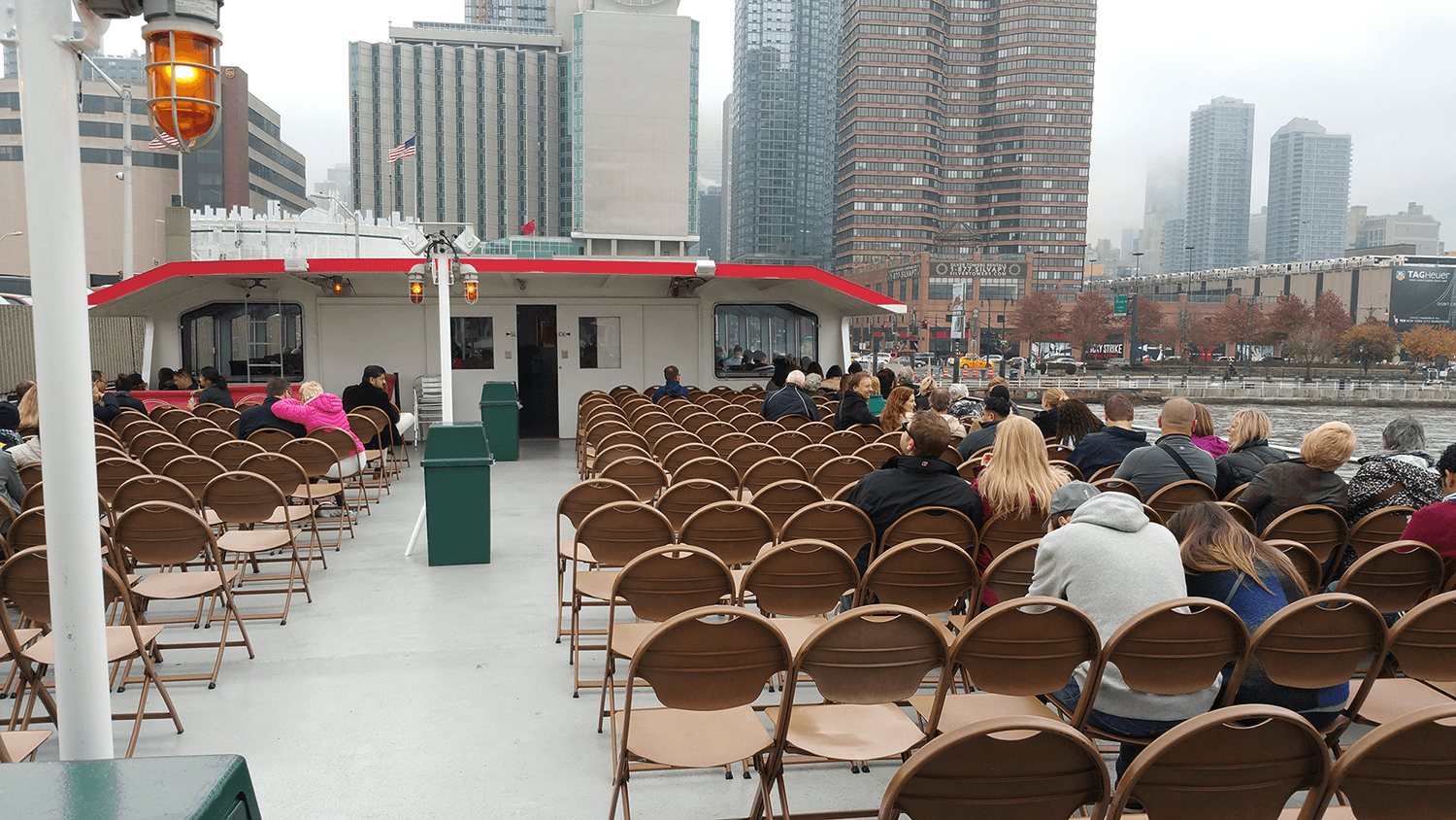
I then proceeded to purchase a ticket, board the cruise, and immerse myself in the experience, taking detailed notes throughout. I observed everything from the sights to the onboard amenities, and engaged with fellow passengers to gather their thoughts and opinions. I asked if they would take this cruise again and if they would recommend it to others. I evaluated the food, purchasing opportunities, and the guide's attempts at humor and commentary.
Afterwards, I interviewed a half-dozen customers to gain a deeper understanding of what they enjoyed and what pain points they encountered. The results were not promising. Here's what I found:
Ticketing lines are far too long during the peak season.
Customers are not informed of tricky scenarios (e.g. issues with the tides which might prevent the completion of the cruise).
Box office is not flexible enough with ticketing.
Ships left the dock without restocking food supplies, resulting in shortages even on cruises running at 1/4 capacity
Overall the experience felt dated and many customers regretted taking the 3-hour cruise due to its length.
Box office and front entrance
The body language of these customers suggested that they were bored of their 3-hour cruise. I was certainly ready to disembark.
04
The online experience was broken
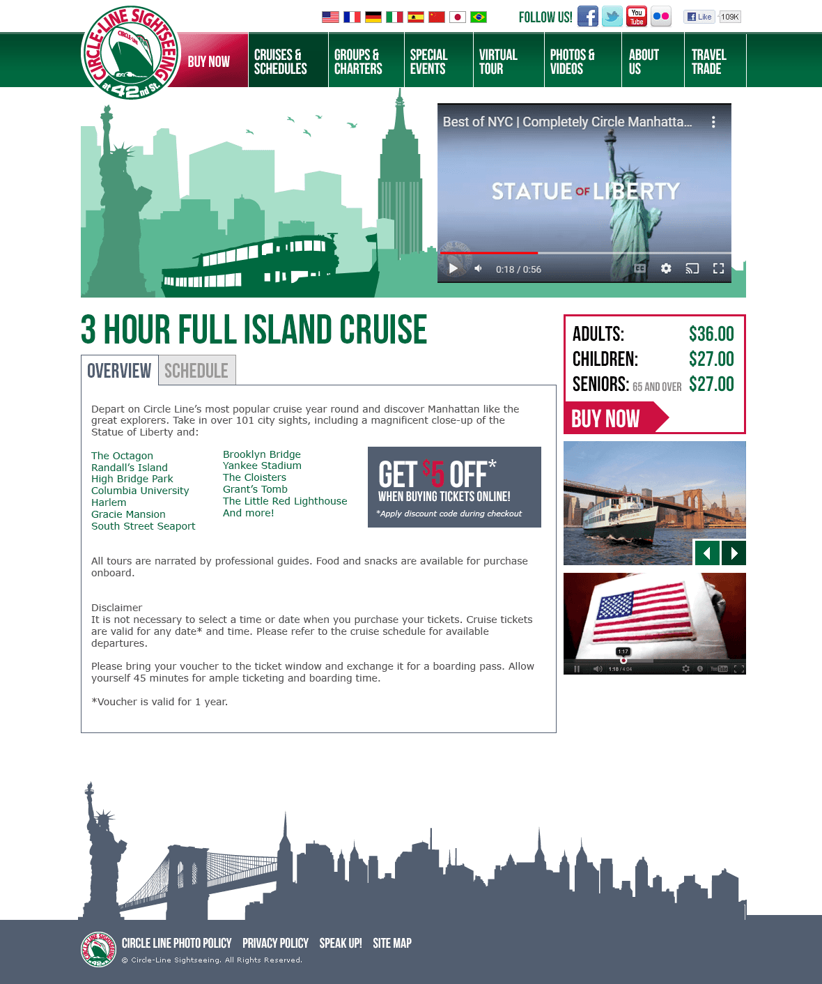
To thoroughly assess the issues, I conducted an expert heuristic review of the ticketing and checkout experience. This exercise yielded 16 recommendations, ranging from aesthetics to usability and accessibility concerns. The key takeaway was clear: Circle Line needed to overhaul their online presence from the ground up.
05
Modernizing and streamlining online ticketing


